Introducing the New Look of Nanak Flights
Posted on November 24, 2017 • 3 minutes • 493 words
Table of contents

Planning a trip can come with all different emotions! An exciting new trip abroad, a visit to see family for the first time in awhile, a life changing event trip, whatever the travel reason, you never want your booking experience to be a headache. You’re not only making a huge decision, but also spending likely a big chunk of money. It’s usually something that you’d like to make a stress-free, enjoyable experience.
New design for Nanak Flights
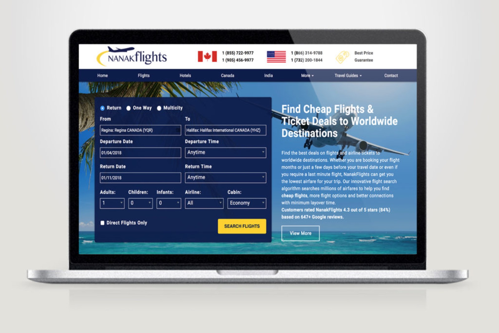
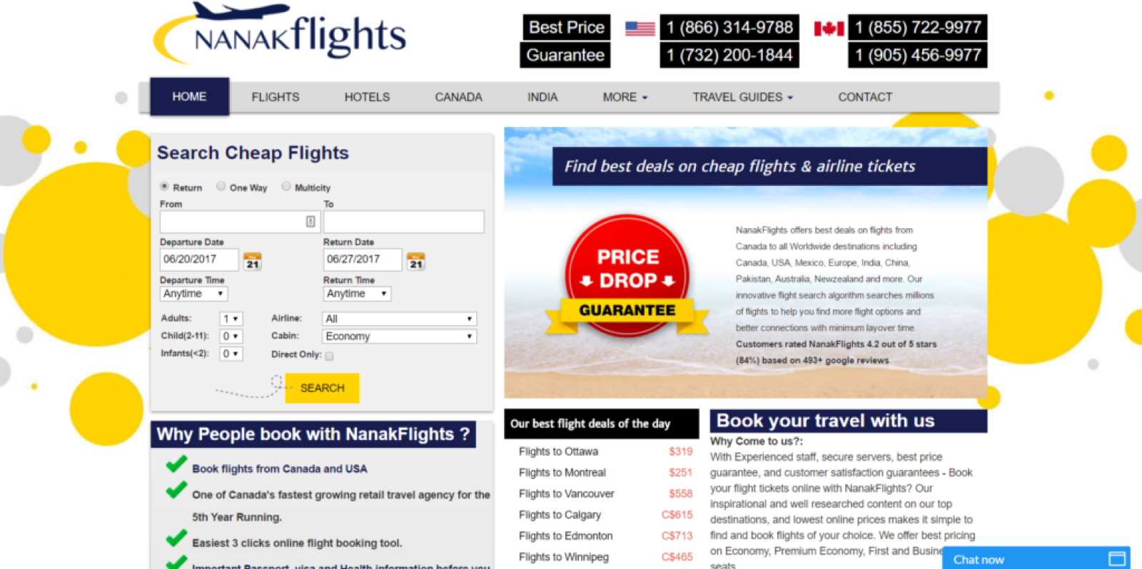
This brings me to introducing the redesign of Nanak Flights ! Nanak Flights recently underwent a web design facelift and focused on bringing an easier, user friendly experience to it’s customers.
If you’re not sure what Nanak Flights are, well - Rather than you searching airline after airline for the cheapest option, least amount of layovers, quickest flight time and best connections, Nanak Flights does it for you! They handle all the heavy lifting and make booking a flight an actual enjoyable and exciting experience and now, even easier with their great new interface. 
Clean user interface
The user interface is clean, simple and anyone can navigate it with just a few easy clicks. All of their information, policies, destinations and even other customer reviews are right on the home page, so no time wasted getting all of the important and practical information right away.
After you input your initial details in the flight finder section, it takes just a few moments to find the absolute best deal for you and shows your options at the top of the page, so immediately you get a very quick overview of your options. As you scroll down, you can flesh out those options and find what works best for your travel experience. All of the information in a concise, easy to read and very clear format, making it a breeze to book!

Responsive design
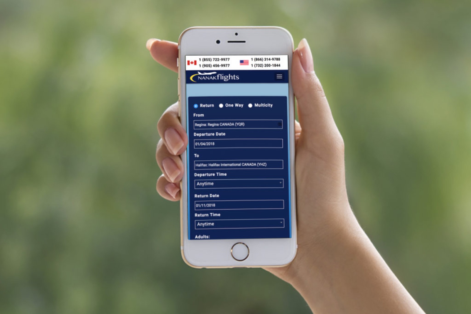
My favourite thing about the new website redesign would have to be having it be responsive! I can use it just as well, if not better on my cell phone and tablet, which is really the industry standard now. Now, more than ever are people using their phones and tablets as their only source of the internet, so having Nanak Flights easier to use on mobile makes a huge difference in my eyes! It’s clearly laid out and functions just as it should. In fact, on mobile, I find I really appreciate their layout even more. It breaks all the important parts of the website into easy to read sections and it’s just pleasing to the eye.
Great colour choices, font size, icon representation and photography. If the usability on mobile doesn’t feel right, it can easily frustrate the user, but Nanak Flights gets an A+ here with making the navigation, and entire process very simple.
From mobile, to desktop I’d say Nanak Flights new redesign is a big success and will surely alleviate any stress you may have felt booking your flights before!


